Probability tree diagram with multicolor text
Creating a probability tree diagram with multicolor fonts
The Python package NetworkX is very useful if you want to work with graphs to visualize complex networks. The package is amazing as is, but for a specific project I wanted to customize the color of the fonts and the shape of the graph I was creating. Here I describe the approach I took to make it possible. Before we begin, here’s the list of packages I used in Python:
- matplotlib
- networkx
- plotly (installation in anaconda:
conda install -c plotly chart-studio) - orca (installation in anaconda:
conda install -c plotly plotly-orca)
NetworkX includes data structures for graphs, digraphs, and multigraphs. The type of graph I want to create is a probability tree diagram, a hierarchical structure that shows all the possible outcomes that detach from an initial single event. Here’s an example:
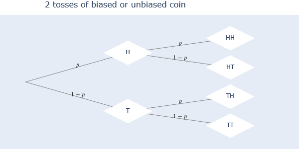
The diagram above shows all the possible outcomes of a coin that is tossed twice. H means ‘Heads’ and T is ‘Tails’. The diagram is read from left to right, where we see that doing one toss we get 2 outputs, and adding to that a second toss we get 4 outputs. The vertex in the leftmost side is called the ‘root’ of the diagram.
The basic NetworkX graph object is created in Python using the line networkx.Graph(). After the object is created, you add nodes and edges (lines between nodes) to it and then plot the result using the networkx.draw(Graph()) command. Here’s an example:
# Import the NetworkX package
import networkx as nx

# Import matplotlib library to visualize the graph in a Jupyter Notebook
import matplotlib.pyplot as plt


# Create a Graph() object and relate it to the variable 'graph_1'
graph_1 = nx.Graph()

# Add nodes to the graph, here 4 nodes labeled from 1 to 4 are added
graph_1.add_nodes_from([1,2,3,4])

# Create edges between nodes. Here node '1' has an edge with all other nodes.
graph_1.add_edges_from([(1,2),(1,3),(1,4)])

# Use the .draw() function to visualize the graph
nx.draw(graph_1,with_labels=True)
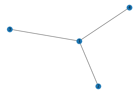
We have a graph with nodes connected by lines. The order in which each node is displayed is random and if we repeat the procedure, we can get a different order. In my case, I want to do a diagram that is read left to right, showing all possible outcomes of a given event. So I need to control the coordinates in which each node appears. To start, here’s an outline of what follows to get my diagram:
1) Use NetworkX functions to create a hierarchy tree that is displayed horizontally, with the ‘root’ at the leftmost side and adding ‘branches’ as we move right.
2) Customize the color of the fonts in the labels of the nodes. (In the coin toss example, we would want the letter ‘H’ to be one color and ‘T’ to be a different color)
I begin by showing how to control the coordinates of the nodes. I start by showing how to position the root and all the nodes in the places I want, by defining a function called hierarchy_pos():
# Create a new Graph() object
graph_2 = nx.Graph()

# Add nodes to the graph
graph_2.add_nodes_from(['root',1,2,3,4])

# Add the edges:
graph_2.add_edges_from([('root',1),('root',2),(1,3),(2,4)])


# NetworkX allows us to check if the graph we created is in fact a Tree
if not nx.is_tree(graph_2): #NODES NAMES MUST BE ALL DIFFERENT or else it won't create a tree
    raise TypeError('cannot use hierarchy_pos on a graph that is not a tree')

# Define the function hierarchy_pos()
def hierarchy_pos(G, root, spread, gap, root_x, root_y, pos=None, parent=None):
    '''
    Modification of Joel's answer at https://stackoverflow.com/a/29597209/2966723.
    Licensed under Creative Commons Attribution-Share Alike. It was modified so that the tree
    was horizontal in the same way of a probability tree diagram.

    G = Graph object
    root = The node that will be the root of the tree
    spread = horizontal space allocated for each branch - avoids overlap with other branches
    gap = gap between levels of hierarchy in the tree
    root_x = the x-axis value of the root
    root_y = the y-axis value of the root
    pos = position
    parent =

    If the graph is a tree this will return the positions to plot this in a
    hierarchical layout.

    Returns a dictionary with the hierarchy positions for a horizontal tree.
    '''

    if pos is None:
        pos = {root:(root_x, root_y)}
    else:
        pos[root] = (root_x, root_y)

    #Get the neighbors of the root. Neighbors are all nodes connected to a 'parent' node
    neighbors = list(G.neighbors(root))

    if not isinstance(G, nx.DiGraph) and parent is not None:
        neighbors.remove(parent)  # allows back compatibility with nx version 1.11

    if len(neighbors)!=0:
        sp = spread/len(neighbors) #sp divides the spread by all neighbors
        nextxH = root_y + spread/2 + sp/2
        for n in neighbors:

            nextxH -= sp #Next horizontal position for a Horizontal graph
            pos = hierarchy_pos(G,n, spread=sp, gap=gap,
                                     root_y=nextxH,root_x=root_x+gap,
                                     pos=pos, parent = root)

    return pos

# Use the function with the graph we created
positions = hierarchy_pos(graph_2, 'root', 0.4, 0.13, root_x = 0, root_y = 0.5, pos=None, parent=None)
positions
{'root': (0, 0.5),
 1: (0.13, 0.5999999999999999),
 3: (0.26, 0.5999999999999999),
 2: (0.13, 0.39999999999999986),
 4: (0.26, 0.39999999999999986)}
We get a dictionary with each node as the key and the (x,y) coordinate as their respective value. NOTE: Two or more nodes can’t have the same name, or the graph won’t be created. That’s why storing the data in a dictionary is very helpful.
Now we use the dictionary to create a plotly scatter plot. First we need to create two helper functions to get the information that plotly needs for the plot:
def node_traces(G,pos,root_trace,node_trace,node_Mcolor='white'):
    '''
    Helper function
    Provides the information of the plotly traces for nodes.
    G = graph object
    pos: position of nodes
    root_trace: the root plotly trace settings
    node_trace: the node plotly trace settings
    node_Mcolor: assign a color to the node, default white

    Adds data to the plotly traces. Traces have to be created prior using plotly.
    '''
    for node in G.nodes():
        x, y = pos[node]
        if node == '':
            root_trace['x'] += tuple([x])
            root_trace['y'] += tuple([y])
        else:
            node_trace['x'] += tuple([x])
            node_trace['y'] += tuple([y])
            node_trace['text']+=tuple([node])
            node_trace['marker']['color']+=tuple([node_Mcolor])

def edge_traces(G,pos,edge_trace):
    '''
    Helper function
    Provides the information of the plotly traces for edges lines and labels.
    G = graph object
    pos: position of nodes
    edge_trace: the edge plotly trace settings

    Adds data to the plotly traces. Traces have to be created prior using plotly.
    '''
    for edge in G.edges():
        x0, y0 = pos[edge[0]]
        x1, y1 = pos[edge[1]]
        edge_trace['x'] += tuple([x0, x1, None])
        edge_trace['y'] += tuple([y0, y1, None])
Now we plot our graph using plotly:
# Import the pltoly libraries that are needed
import chart_studio.plotly as ply
import plotly.graph_objs as go
from plotly.offline import init_notebook_mode, iplot
import plotly.io as pio

# Choose a plot theme style. Here we choose 'none' because we only need the nodes and edges to show in the plot.
pio.templates.default = "none"

#Allow plotly to plot inside notebook
init_notebook_mode(connected=True)

# Create an empty Scatter object for the edges
edge_trace = go.Scatter(
    x=[],
    y=[],
    line=dict(width=0.9,color='#777'),
    text=[],
    mode='lines')

# Fill the edge_trace scatter object using the helper function edge_traces()
edge_traces(graph_2,positions,edge_trace)

# Create an empty Scatter object for the root
root_trace = go.Scatter(
    x=[],
    y=[],
    text=[],
    mode='text',
    marker=dict(
        showscale=False,
        color=[],
        size=0))

# Create an empty Scatter object for the nodes
node_trace = go.Scatter(
    x=[],
    y=[],
    text=[],
    textfont=dict(size=14),
    mode='markers+text',
    name='Nodes',
    showlegend=False,
    marker=dict(
        symbol = 'circle',
        showscale=False,
        color=['#9ea3f2']*5,
        size=50))

# Fill root_trace and node_trace using the helper function node_traces()
node_traces(graph_2,positions,root_trace,node_trace) #Fill root_trace and node_trace

# Create a plotly Figure with our node and edges data
fig = go.Figure(data=[root_trace,edge_trace, node_trace],
                layout=go.Layout(
                hovermode='closest', #Plotly allows us to hover over a node to get additional info
                autosize=True,
                height=500,
                width= 800,
                title='Graph 2',
                titlefont=dict(size=16),
                showlegend=False,
                margin=dict(b=0,l=0,r=0,t=30)))

# plot the figure
iplot(fig)
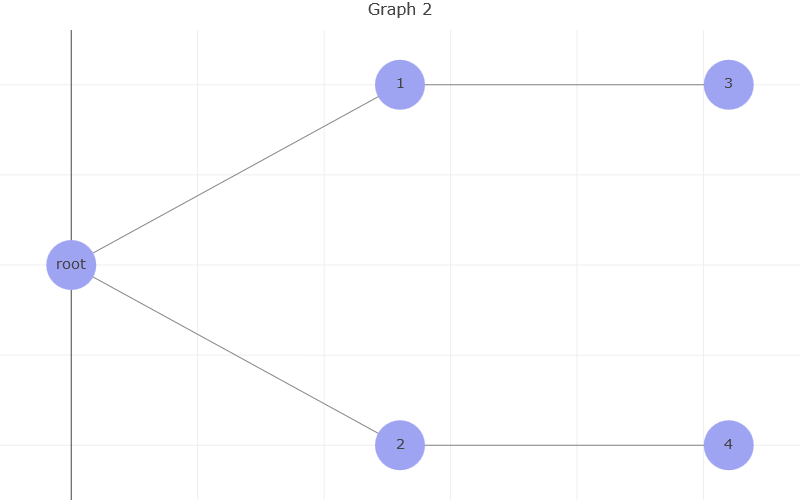
Now we have a graph that looks more like our diagram. We have a horizontal distribution and the root is on the leftmost side of the plot. Each new branch will appear to the right of its ‘parent’ node.
The next par is customizing the font color of the labels that appear in each node. In this case, I want to do a tree diagram that explains the probability of a patient having a disease. I want to use the following convention for the labels:
- S = Sick patient
- Sc = Healthy patient
- T = Test positive
- Tc = Test negative
I want to be able to use the color coding for each combination of events. Here are all possible combinations:
- Patient is healthy but test is positive = Sc∩T
- Patient is healthy and test is negative = Sc∩Tc
- Patient is sick and test is positive = S∩T
- Patient is sick and test is negative = S∩Tc
Unfortunately, NetworkX doesn’t allow us to use multicolor fonts in the labels as seen above. We are going to use LaTeX syntax to create our multicolor text, and plotly will allow us to do that. LaTex is already available in Jupyter notebooks, so there’s no need to install anything else.
If we want to write the label for the case where a patient is healthy and the test is negative, we will use the following LaTex syntax:
$\color{green}{S^c}∩\color{red}{T^c}$
which results in: Sc∩Tc.
We will create a new graph and add nodes and edges to illustrate our patient case. To make the list of multicolored-labeled nodes and edges easier to create, we use tow dictionaries, test_nodes for the nodes and test_edges_labls for the edge labels:
test_nodes = {0:('',[1,2]), #The root is given an empty string so that
            1:('$\color{green}{\LARGE S}$',[3,4]), #Patient is positive
            2:('$\color{green}{\LARGE S^c}$',[5,6]), #Patient is negative
            3:('$\color{green}{\LARGE S}\LARGE \cap\color{red}{\LARGE T}$',None), #Patient positive, Test positive
            4:('$\color{green}{\LARGE S}\LARGE \cap\color{red}{\LARGE T^c}$',None),#Patient positive, Test negative
            5:('$\color{green}{\LARGE S^c}\LARGE \cap\color{red}{\LARGE T^c}$',None),#Patient neg, Test neg
            6:('$\color{green}{\LARGE S^c}\LARGE \cap\color{red}{\LARGE T}$',None)}#Patient neg, Test pos

test_edges_labls = {'01':'$P(\color{green}{S})\\\ 0.001$',
                   '02':'$P(\color{green}{S^c})\\\ 0.999$',
                   '13':'$P(\color{red}{T}|\color{green}{S})\\\ 0.95$',
                   '14':'$P(\color{red}{T^c}|\color{green}{S})\\\ 0.05$',
                   '25':'$P(\color{red}{T^c}|\color{green}{S^c})\\\ 0.95$',
                   '26':'$P(\color{red}{T}|\color{green}{S^c})\\\ 0.05$'}
Breaking down our dictionaries, we see that test_nodes has 7 nodes (counting node 0), node 0 being the root. Each node uses a value of a tuple, where we see the label of the node in LaTex syntax and a list of the node’s ‘children’, which are the nodes that branch out from the ‘parent’ node. Notice that nodes 3 to 6 don’t have any children, because the tree has no more branches after them.
test_edges_labls are the labels that are place in the edges in between nodes. The key for each label is the combination of the origin node with the destination node that create the edge. The first label has the key ‘01’ meaning that the label value goes in the edge tha goes from node 0 to node 1.
To use our dictionaries, we need to create a function that builds our NetworkX graph using this information. Then we get the positions using the hierarchy_pos() and finally we plot.
def tree(nodes={}, spread=0.3, gap=0.01, edge_labels=None):
            '''
            root: the root node of current branch
            - if the tree is directed and this is not given,
              the root will be found and used
            - if the tree is directed and this is given, then
              the positions will be just for the descendants of this node.
            - if the tree is undirected and not given,
              then a random choice will be used.

            nodes: dictionary of nodes by key(int)->(node name(str),node children(list)).
                   The keys need to follow a numerical order, where lowest int is the root and largest
                   int is the furthest node.

            spread: horizontal or vertical space allocated for this branch - avoids overlap with other branches

            gap: gap between levels of hierarchy

            root_x: horizontal location of root

            root_y: vertical location of root


            edge_labels: dictionary of edges where key is a string concatenating two nodes from nodes dict
                         key(str(nodes[parent int])+str(nodes[child int]))->label(str)

            pos: a dict saying where all nodes go if they have been assigned
            parent: parent of this branch. - only affects it if non-directed

            A networkx graph object, self.G, a tree, is created using the data in 'nodes'.
            '''
            G = nx.Graph()
            edge_list = [] #List of edges to add to networkx graph
            edge_Outlabels = {} #Dictionary of labels assigned to each edge
            for parent in nodes:
                try:
                    for child in nodes[parent][1]:
                        try:
                            edge_list.append((nodes[parent][0],nodes[child][0]))
                            edge_Outlabels[(nodes[parent][0],nodes[child][0])] = \
                            edge_labels['%s%s'%(parent,child)]
                        except TypeError:
                            continue
                except TypeError:
                            continue


            G.add_edges_from(edge_list)

            return (G,edge_Outlabels)


diagram = tree(nodes=test_nodes, spread=0.3, gap=0.01,
               edge_labels=test_edges_labls)

diagram_graph, diagram_edge_labels = diagram[0], diagram[1]
We have the created the NetworkX graph which is stored in the diagram_graph variable. We also stored the dictionary of labels in the diagram_edge_labels.
We can now use the hierarchy_pos() function to give ordered positions to our nodes:
diagram_pos = hierarchy_pos(G=diagram_graph, root=test_nodes[0][0], spread=0.4, gap=0.13,
                            root_x = 0, root_y = 0.5, pos=None, parent=None)
Finally we plot, but first we cretae a helper function, edge_midpoint(), to calculate the point in between edges where we are going to place our edge labels:
def edge_midpoint(nStart,nEnd):
    '''
    Returns the midpoint of a given edge given its start -> end nodes.
    nStart = start node tuple, nEnd = end node tuple
    returns: a tuple, edge midpoint with x,y coordinates.
    '''
    mid = ((nStart[0]+nEnd[0])/2,(nStart[1]+nEnd[1])/2)
    return mid
Now we can use plotly to plot:
# Create an empty Scatter object for the edges
edge_trace = go.Scatter(
    x=[],
    y=[],
    line=dict(width=0.9,color='#777'),
    text=[],
    mode='lines')

# Fill the edge_trace scatter object using the helper function edge_traces()
edge_traces(diagram_graph,diagram_pos,edge_trace)

# Create an empty Scatter object for the root
root_trace = go.Scatter(
    x=[],
    y=[],
    text=[],
    mode='text',
    marker=dict(
        showscale=False,
        color=[],
        size=0))

# Create an empty Scatter object for the nodes
node_trace = go.Scatter(
    x=[],
    y=[],
    text=[],
    textfont=dict(size=14),
    mode='markers+text',
    name='Nodes',
    showlegend=False,
    marker=dict(
        symbol = 'circle',
        showscale=False,
        color=[],
        size=50))

# Fill root_trace and node_trace using the helper function node_traces()
node_traces(diagram_graph,diagram_pos,root_trace,node_trace) #Fill root_trace and node_trace

annotations = []

for edge in diagram_graph.edges:
    label = edge_midpoint(diagram_pos[edge[0]],diagram_pos[edge[1]])
    annotations.append(dict(x=label[0],y=label[1],xref='x',yref='y',text=diagram_edge_labels[edge],
                           showarrow=True,borderpad=1,align='center',ax=3,ay=-5,arrowsize=1,arrowwidth=1,
                           font=dict(size=12,color='#333')))

# Create a plotly Figure with our node and edges data
fig = go.Figure(data=[root_trace,edge_trace, node_trace],
                layout=go.Layout(
                hovermode='closest', #Plotly allows us to hover over a node to get additional info
                annotations = annotations,
                autosize=True,
                height=500,
                width= 800,
                title='Patient Probability Tree',
                titlefont=dict(size=16),
                showlegend=False,
                margin=dict(b=0,l=0,r=0,t=30)))
# Remove the grid and the zero line in the x axis to get a cleaner plot.
fig.update_yaxes(showgrid=False)
fig.update_xaxes(showgrid=False, zeroline=False)

# plot the figure
iplot(fig)
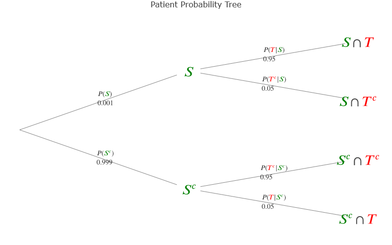
Here we have our multicolor-labeled diagram, very helpful to visualize the different scenarios and their probability.
All the functions we used in this notebook can be compiled into a single script. By creating a Python class, I assembled this and other methods that helped me replicate the same concept when plotting other diagrams. The class TreeGraph can be found in this Github repository.
To use the class, download it and upload it to python using the folowing code: from TreeGraph import*